From Polaroid to Peninsula
Our logo is comprised of four distinct elements, where each individual section comes together to create a design that is not only unique, but creates an identity that allows Escarpment to stand alone as a symbol for everything we love about Door County.

The Polaroid - The outline of our logo, shaped like a Polaroid, symbolizes our brand's dedication to capturing and preserving the beauty of the great outdoors. This iconic shape reflects our commitment to the snapshot memories we create in Door County. Inviting wearers to frame their experiences with Escarpmnt.
 The Outline - Our logo centers around the outline of the Door Peninsula to anchor our brand in the unique landscapes that inspire every piece we create. By incorporating the peninsula's outline into our logo, we invite our community to carry a piece of Door County with them, fostering a sense of belonging and a reminder of the adventures that await in its iconic settings.

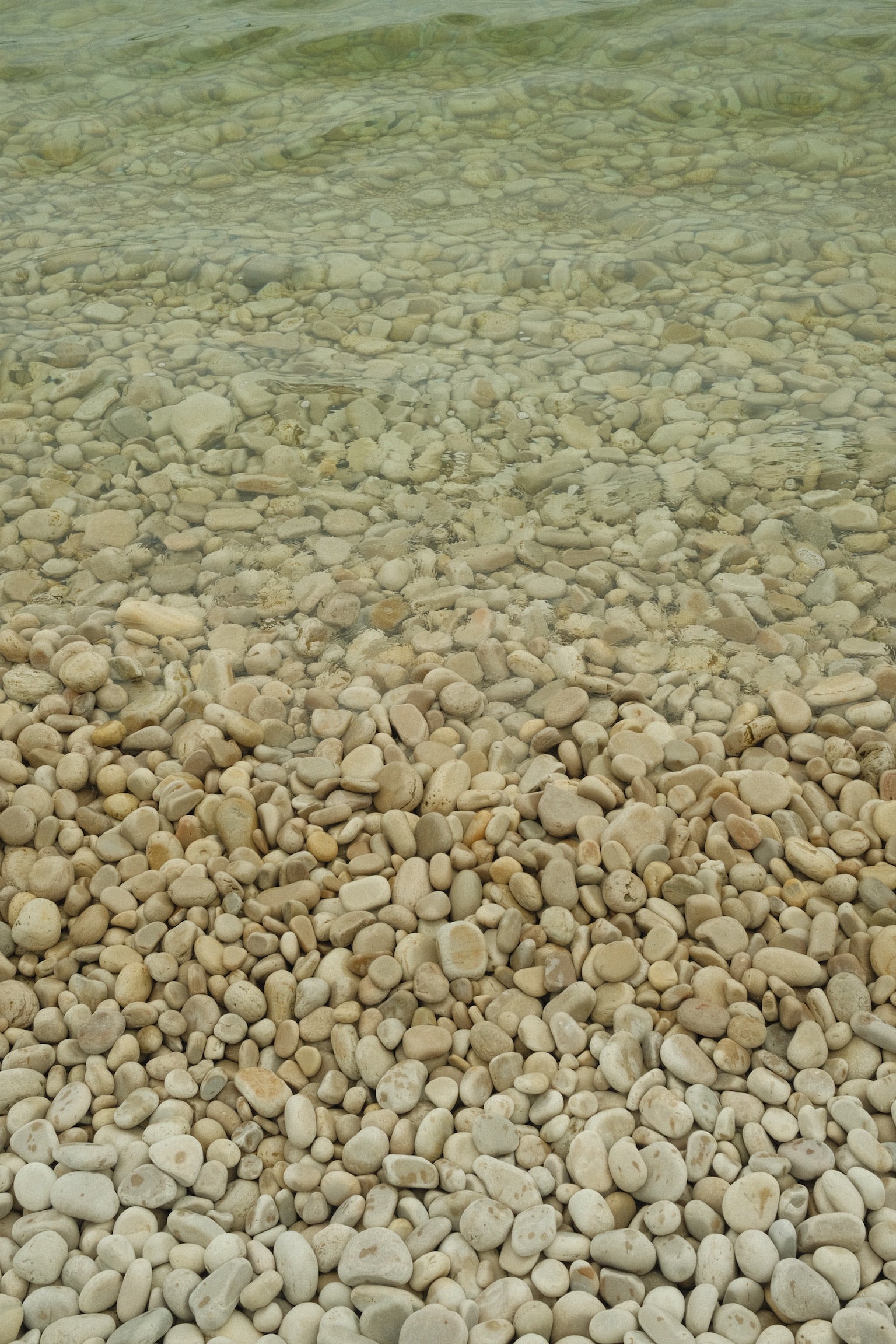
"Escarpmnt" - The use of the word Escarpmnt in our logo is an ode to the landscapes that inspire us. The distinctive spelling captures our modern twist on the over 400 million year old Niagara Escarpment. By embedding this homage directly in our brand identity, we deepen the connection between our apparel and the peninsula, encouraging a celebration of both history and exploration.

.